Design of Everyday Shiny Apps
posit::conf(2025) · PHUSE, March 2026
talk
ux
shiny
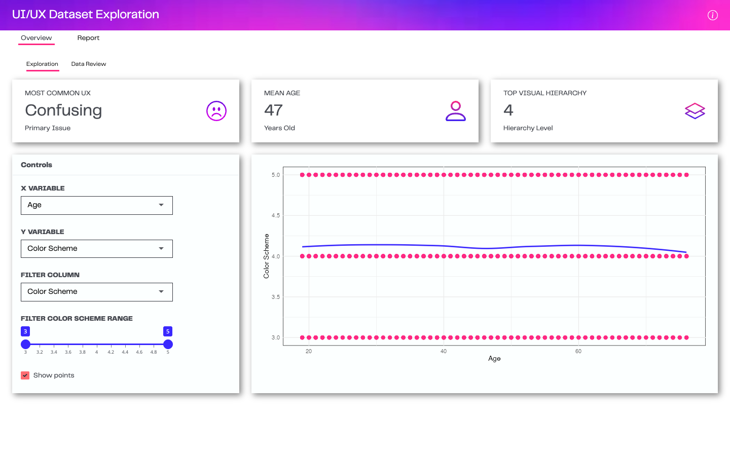
Our talk from posit::conf(2025) and PHUSE (March 2026): a working client Shiny app, redesigned on stage through layout, color, typography and components.
I gave this talk with Maya Gans, first at posit::conf(2025) and again at PHUSE in March 2026. In it, we take a working client Shiny app and rebuild it step by step, one design lever at a time. Huge thanks to Maya, my co-presenter and co-builder on this one, and on Handsome Table too.
Watch the talk
The problem
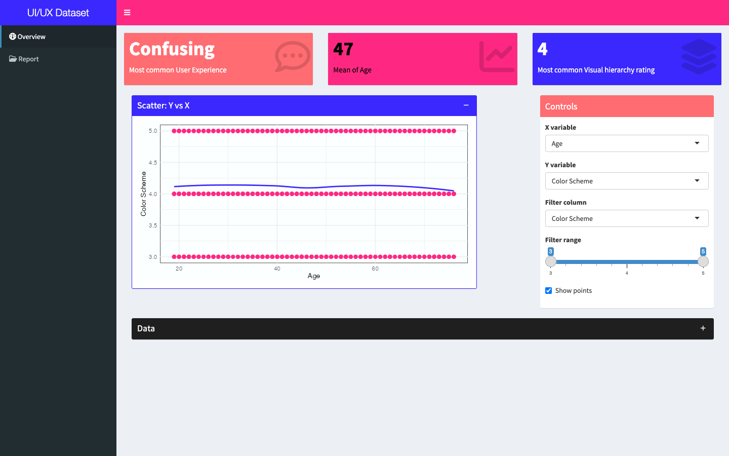
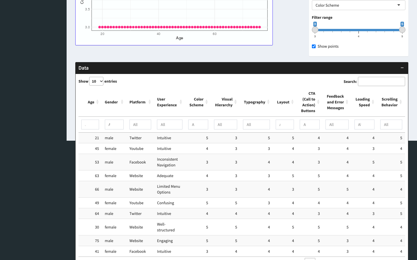
The client’s Shiny app worked, but it was hard to use. Navigation was inconsistent, color competed for attention everywhere, and tables and actions gave users little guidance.
Before and after
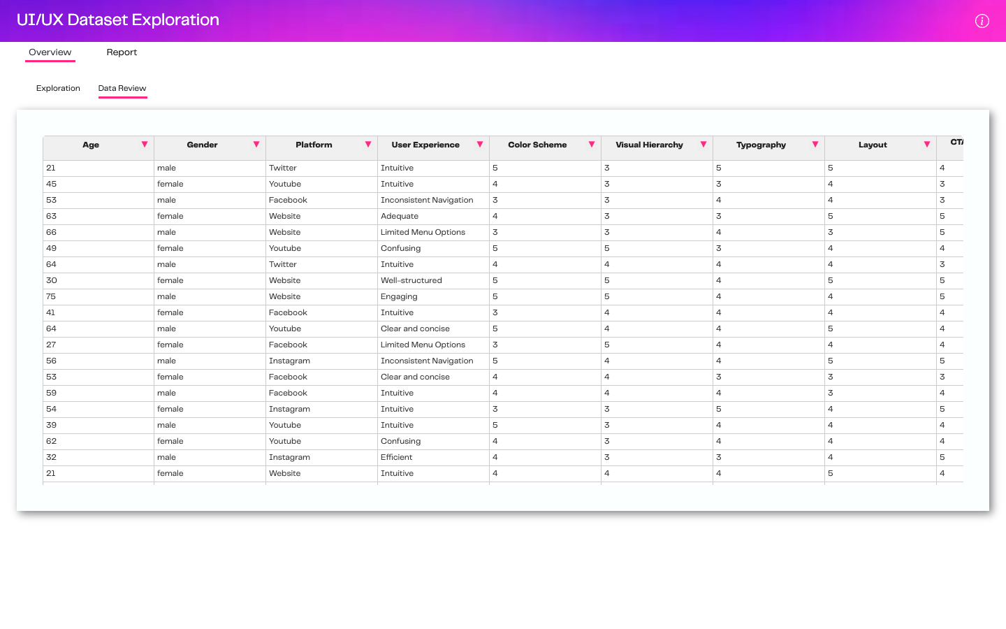
These screens use the public UX survey dataset from the talk.
The four design levers
- Layout. A cohesive experience starts with a clear structure: intuitive user journeys, consistent flow and streamlined grid layouts that make navigation familiar.
- Color. The original app followed brand guidelines. The redesign uses color on purpose, as an accent that highlights key information and actions without overwhelming the user.
- Typography. One client font, with hierarchy built from size and weight to guide attention and improve readability.
- Components. Handsome Table, a custom Handsontable wrapper, for friendlier tables; tooltips and popovers for extra detail without clutter; and visual feedback for every action, with a confirmation step for serious ones like deletions.
Code and apps
The original app and the redesigned version are in the talk repo. Each step of the talk has its own branch.